|
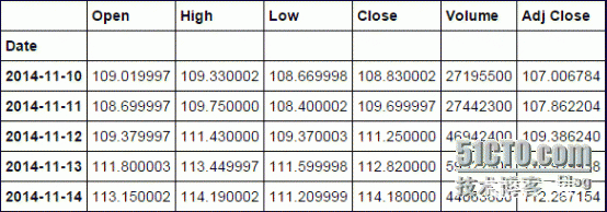
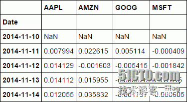
前言:对于股票的研究我想,无论是专业人士还是非专业人士都对其垂涎已久,因为我们都有赌徒的心态,我们都希望不花太多的时间但是能赚足够的钱,而股票是一个好的选择,本人也不例外对股票垂涎已久,不管你是否承认股票是一个来钱快的地方,但是伴随着的当然是巨大的风险,毕竟这么多炒股,并不是每个人都赚到了钱,下面的内容也不一定保证你一定能赚到钱,反正都是“猜”,不如让“猜”看起来更加专业一些。 原文章参考:http://nbviewer.ipython.org/github/jmportilla/Udemy-notes/blob/master/Data%20Project%20-%20Stock%20Market%20Analysis.ipynb 首先当然是导入我们需要的模块了 import pandas as pd from pandas import Series,DataFrame import numpy as np import matplotlib.pyplot as plt import seaborn as sns sns.set_style("whitegrid") %matplotlib inline from pandas.io.data import DataReader from datetime import datetime from __future__ import division 注:其实国内的股票相关行情可以通过tushare这个库获取,但是碍于自己已经对着原文自己演练了一遍了,图都已经截好了,也就没有将股票中国化,分析的主要是AAPL,GOOG,MSFT,AMZN,数据来自Yahoo。 tushare相关信息参考:http://tushare.waditu.com/ ###股票代码 stock_lis = ["AAPL","GOOG","MSFT","AMZN"] ###开始及结束时间,这里我们去最近一年的数据 end = datetime.now() start = datetime(end.year - 1,end.month,end.day) ###将每个股票的近一年行情遍历出来 for stock in stock_lis: globals()[stock] = DataReader(stock,"yahoo",start,end) 看看前面五条信息 AAPL.head()
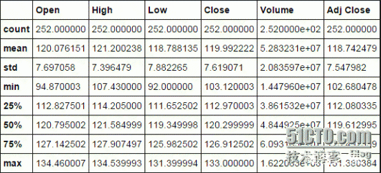
AAPL.describe()
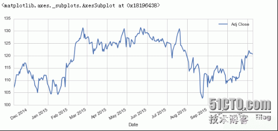
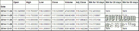
AAPL.info() DatetimeIndex: 252 entries, 2014-11-10 00:00:00 to 2015-11-09 00:00:00 Data columns (total 6 columns): Open 252 non-null float64 High 252 non-null float64 Low 252 non-null float64 Close 252 non-null float64 Volume 252 non-null int64 Adj Close 252 non-null float64 dtypes: float64(5), int64(1) memory usage: 13.8 KB 画一下每日调整收盘价的走势图 注:每日收盘价http://baike.baidu.com/link?url=plkht9HaMdpNPI2lFUsUvgYhjdYvqOlSStjrDvqQxhuHuA5Iaww_FVitVXEqp_ne0DATpwtuBKeSUPK8I1t4ka AAPL["Adj Close"].plot(legend=True,figsize=(10,4))
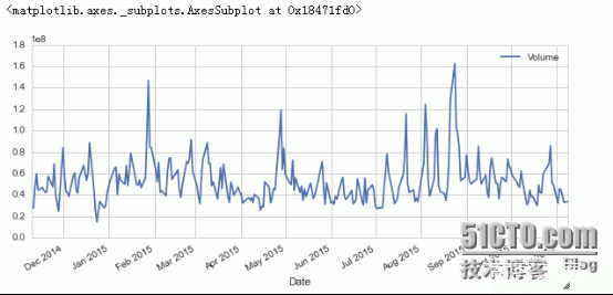
###每日成交量 AAPL["Volume"].plot(legend=True,figsize=(10,4))
下面两个链接有关移动平均线的一些说明 1.) http://www.investopedia.com/terms/m/movingaverage.asp 2.) http://www.investopedia.com/articles/active-trading/052014/how-use-moving-average-buy-stocks.asp 当然也可以瞧瞧百度百科:http://baike.baidu.com/view/7973.htm 注:在tushare这个模块里获取的国内行情的相关信息就已经包揽了常用的均线了,非常赞! 参考:http://tushare.waditu.com/trading.html import tushare as tsts.get_hist_data('600848') #一次性获取全部日k线数据 结果显示: open high close low volume p_change ma5 \ date 2012-01-11 6.880 7.380 7.060 6.880 14129.96 2.62 7.060 2012-01-12 7.050 7.100 6.980 6.900 7895.19 -1.13 7.020 2012-01-13 6.950 7.000 6.700 6.690 6611.87 -4.01 6.913 2012-01-16 6.680 6.750 6.510 6.480 2941.63 -2.84 6.813 2012-01-17 6.660 6.880 6.860 6.460 8642.57 5.38 6.822 2012-01-18 7.000 7.300 6.890 6.880 13075.40 0.44 6.788 2012-01-19 6.690 6.950 6.890 6.680 6117.32 0.00 6.770 2012-01-20 6.870 7.080 7.010 6.870 6813.09 1.74 6.832 ma10 ma20 v_ma5 v_ma10 v_ma20 turnover date 2012-01-11 7.060 7.060 14129.96 14129.96 14129.96 0.48 2012-01-12 7.020 7.020 11012.58 11012.58 11012.58 0.27 2012-01-13 6.913 6.913 9545.67 9545.67 9545.67 0.23 2012-01-16 6.813 6.813 7894.66 7894.66 7894.66 0.10 2012-01-17 6.822 6.822 8044.24 8044.24 8044.24 0.30 2012-01-18 6.833 6.833 7833.33 8882.77 8882.77 0.45 2012-01-19 6.841 6.841 7477.76 8487.71 8487.71 0.21 2012-01-20 6.863 6.863 7518.00 8278.38 8278.38 0.23 这里的平均线是通过自定义函数,手动设置的,主要是10,20,50日均线 ###移动平均线: ma_day = [10,20,50] for ma in ma_day: column_name = "MA for %s days" %(str(ma)) AAPL[column_name] = pd.rolling_mean(AAPL["Adj Close"],ma) 瞧瞧效果
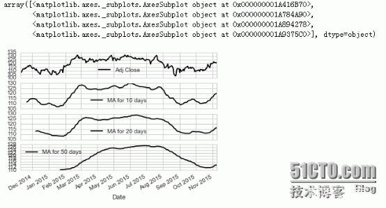
AAPL[10:15] 默认subplots这个参数是False的,这里我们瞧瞧True的情况 AAPL[["Adj Close","MA for 10 days","MA for 20 days","MA for 50 days"]].plot(subplots=True)
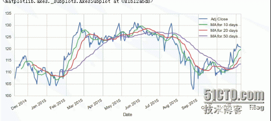
AAPL[["Adj Close","MA for 10 days","MA for 20 days","MA for 50 days"]].plot(figsize=(10,4)) 很好看有没有!!!
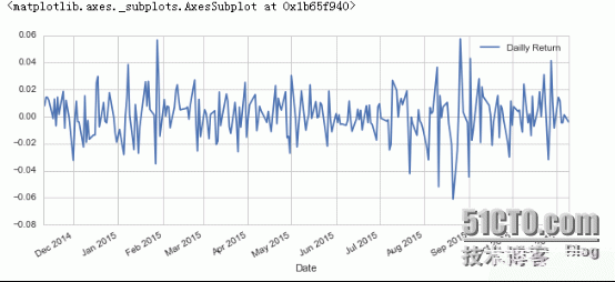
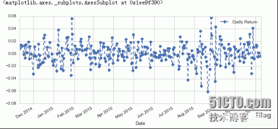
让我们新建一个字段叫做“Dailly Return”,注意Dailly其实我写错了,Dailly Return其实是每日较于前一日的涨幅率. AAPL["Dailly Return"] = AAPL["Adj Close"].pct_change() ###plot一下 AAPL["Dailly Return"].plot(figsize=(10,4),legend=True)
###这里我们改变一下线条的类型(linestyle)以及加一些标记(marker) AAPL["Dailly Return"].plot(figsize=(10,4),legend=True,linestyle="--",marker="o")
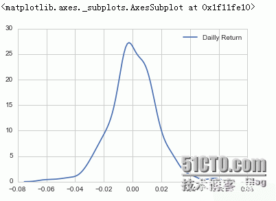
###再来瞧瞧核密度评估图吧,这里吧Nan指给drop掉 sns.kdeplot(AAPL["Dailly Return"].dropna())
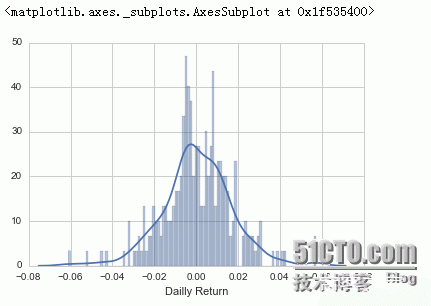
注:This function combines the matplotlib hist function (with automatic calculation of a good default bin size) with the seaborn kdeplot() and rugplot() functions. 由官方说明可知,displot函数是由直方图与seaborn的核密度图以及rugplot(Plot datapoints in an array as sticks on an axis.)组合 ###plot一下 sns.distplot(AAPL["Dailly Return"].dropna(),bins=100)
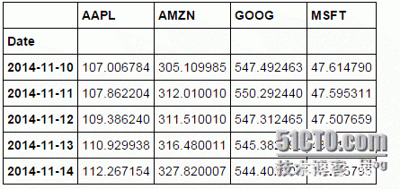
###再来单独获取一下每个公司的调整收盘价记录 closing_df = DataReader(stock_lis,"yahoo",start,end)["Adj Close"] closing_df.head()
###将每个公司的每日收盘价的百分数变化,及涨幅或者降幅,通过这个我们可以评估它的涨幅前景 tech_rets = closing_df.pct_change() tech_rets.head()
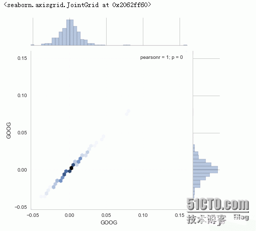
###平均值都是大于0的,不错 tech_rets.mean() AAPL 0.000456 AMZN 0.003203 GOOG 0.001282 MSFT 0.000623 dtype: float64 我们来瞧瞧jointplot这个函数,通过这个函数我们可以画出两个公司的”相关性系数“,或者说皮尔森相关系数(http://baike.baidu.com/view/3028699.htm),如下图所示 如果你看过《大数据时代》这本书,你就会知道为什么作者会求两个公司的相关性了,书中有提到的一个观点是,在大数据时代的到来,我们可以通过大数据来描绘事物之间的相关性并预测,而为什么,是后面要研究的事,注重相关性而不是因果关系。(个人读后感,如有偏驳还望指正) 下面这一部分主要在说相关性~ sns.jointplot("GOOG","GOOG",tech_rets,kind="hex")
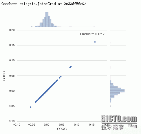
如上图所示,我们画出的事google与google自己的皮尔森相关系数,当然是1啦!值得说明的皮尔森相关系数的值在-1到1之间,1代表正相关,-1代表负相关,0代表没有任何相关性,有兴趣了解怎么算的,参考:https://en.wikipedia.org/wiki/Pearson_product-moment_correlation_coefficient sns.jointplot("GOOG","GOOG",tech_rets,kind="scatter")
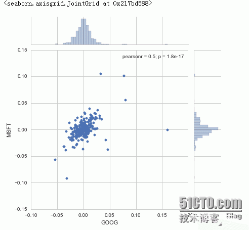
注:上面两张图画的是同一件事物,不过我们kind指定的不同,分别是六边形hex,散点scatter 我们再来画画Google与微软的皮尔森相关系数吧 sns.jointplot("GOOG","MSFT",tech_rets,kind="scatter")
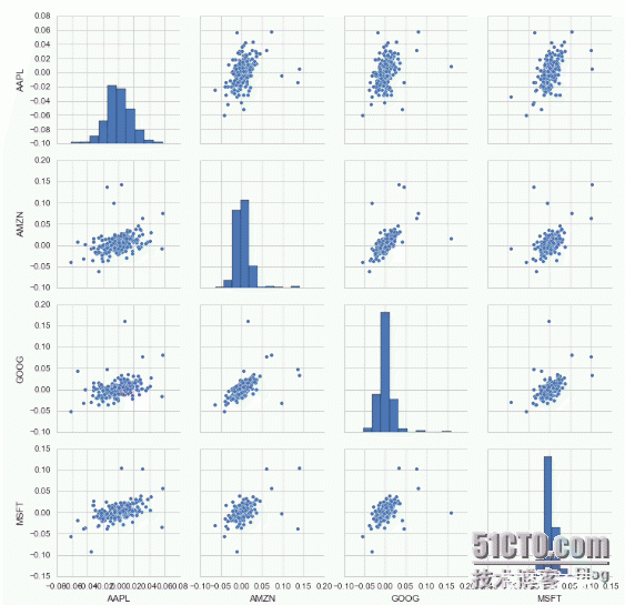
下面是一些相关知识,有兴趣可以瞧瞧 如何计算协方差: http://zh.wikihow.com/%E8%AE%A1%E7%AE%97%E5%8D%8F%E6%96%B9%E5%B7%AE 如何计算百分比变化: http://zh.wikihow.com/%E8%AE%A1%E7%AE%97%E7%99%BE%E5%88%86%E6%AF%94%E5%8F%98%E5%8C%96 什么是Pearson product-moment: https://en.wikipedia.org/wiki/Pearson_product-moment_correlation_coefficient 我们再来瞧瞧pairplot这个函数吧,四个公司的行情一起比较。 官方说明:Plot pairwise relationships in a dataset. By default, this function will create a grid of Axes such that each variable in data will by shared in the y-axis across a single row and in the x-axis across a single column. The diagonal Axes are treated differently, drawing a plot to show the univariate distribution of the data for the variable in that column. It is also possible to show a subset of variables or plot different variables on the rows and columns. 该函数用于成对的比较不同数据集之间的相关性,而对角线则会显示该数据集的直方图,详情见下图呗,一图抵前言 至于从形态看出相关性,你可能得看看Wikipedia了 sns.pairplot(tech_rets.dropna())
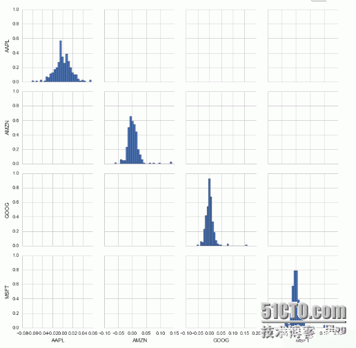
再来瞧瞧Pairplot这个对象 ###我们指画直方图 returns_fig = sns.PairGrid(tech_rets.dropna()) returns_fig.map_diag(plt.hist,bins=30)
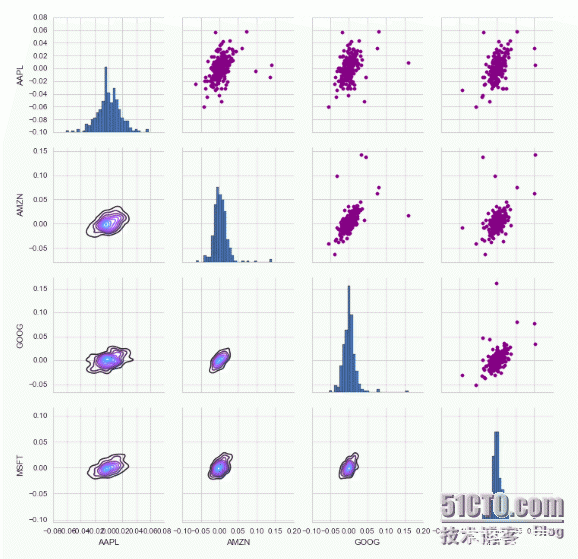
returns_fig = sns.PairGrid(tech_rets.dropna()) ###右上角画散点图 returns_fig.map_upper(plt.scatter,color="purple") ###左下角画核密度图 returns_fig.map_lower(sns.kdeplot,cmap="cool_d") ###对角线的直方图 returns_fig.map_diag(plt.hist,bins=30)
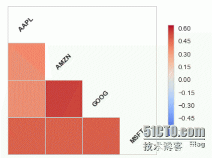
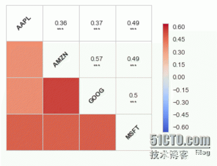
再瞧瞧corrplot这个函数,官方我也敲不到它的说明,主要画相关系数,如下 ###annot设定是否注释 sns.corrplot(tech_rets.dropna(),annot=False)
sns.corrplot(tech_rets.dropna(),annot=True)
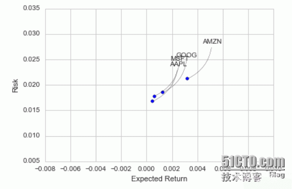
在下面这一部分主要说风险这一部分了,比如推测最多亏多少钱~~ 首先瞧瞧各数值吧 rets = tech_rets.dropna() ###平均值 rets.mean() AAPL 0.000456 AMZN 0.003203 GOOG 0.001282 MSFT 0.000623 dtype: float64 ###标准差 参考:http://baike.baidu.com/view/78339.htm rets.std() AAPL 0.016738 AMZN 0.021165 GOOG 0.018484 MSFT 0.017800 dtype: float64 ###点的大小 area = np.pi *20 ###分别以rets的平均值,标准差为xy轴 plt.scatter(rets.mean(),rets.std()) ###分别设定xy轴的标注 plt.xlabel("Expected Return") plt.ylabel("Risk") for label,x,y in zip(rets.columns,rets.mean(),rets.std()): plt.annotate( label, xy = (x,y),xytext = (50,50), textcoords = "offset points",ha = "right",va = "bottom", arrowprops = dict(arrowstyle = "-",connectionstyle = "arc3,rad=-0.3"))
由上面我们可以看出AMZN亚马逊的预计收益要高于其他三家公司,但是风险值也要高于其他三家公司~这是怎么看出来的呢? 摘自百度百科(http://baike.baidu.com/view/78339.htm):在投资基金上,一般人比较重视的是业绩,但往往买进了近期业绩表现较佳的基金之后,基金表现反而不如预期,这是因为所选基金波动度太大,没有稳定的表现。 衡量基金波动程度的工具就是标准差(Standard Deviation)。标准差是指基金可能的变动程度。标准差越大,基金未来净值可能变动的程度就越大,稳定度就越小,风险就越高 |